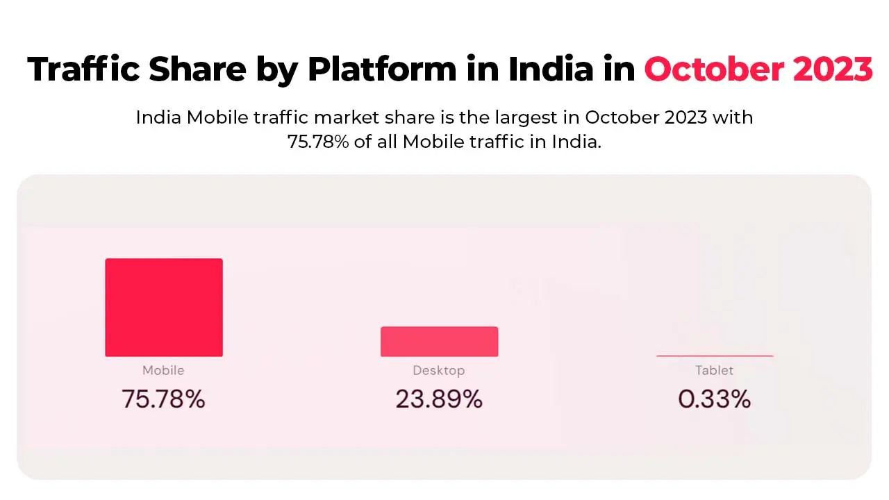
In today’s digital landscape, a website’s adaptability to various devices is no longer a luxury; it’s a necessity. With mobile devices constituting a significant 57.8% of global internet traffic, the demand for seamless user experiences across diverse screens is higher than ever. Responsive web design becomes paramount in this scenario. Implementing best practices in responsive design not only enhances your website’s visibility but also aligns it with the preferences of the majority, leading to increased user engagement and higher conversion rates. As of July 2022, mobile internet traffic peaked at 60.73%, emphasising the critical importance of prioritising a mobile-friendly approach for a competitive edge in the digital sphere.
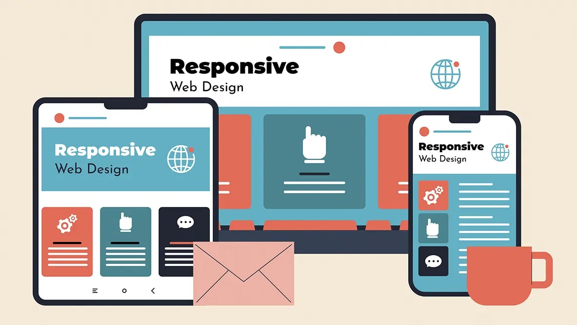
Responsive web design ensures that your website automatically adapts to the user’s device. Whether someone is browsing on a smartphone, tablet, or desktop, your website will look and function flawlessly. This is crucial because mobile usage has surpassed desktop usage, and search engines like Google prioritise mobile-friendly websites in their search results. By embracing responsive web design, you can provide a consistent and optimised experience for all users, regardless of the device they are using.

Key Elements of Responsive Web Design
To create a truly responsive website, there are several key elements that you need to consider:
Flexible Grid Layouts
A flexible grid layout is the foundation of responsive web design. It allows your website to adapt to different screen sizes by using relative units like percentages instead of fixed units like pixels. This ensures that your website’s layout remains intact across various devices.
Media Queries
Media queries are CSS rules that allow you to apply different styles based on the user’s device. By using media queries, you can customise the appearance of your website for different screen sizes, resolutions, and orientations.
Fluid Images
Images play a vital role in web design, but they can also be a major factor in slowing down your website’s performance. To ensure that your images are responsive, you should use CSS techniques like max-width: 100% to make them scale with the size of the viewport.
Mobile-First Approach in Responsive Web Design
In today’s mobile-dominated world, it’s essential to adopt a mobile-first approach in your responsive web design strategy. This means designing your website for mobile devices first and then scaling up for larger screens. By prioritising mobile design, you can ensure that your website is optimised for the majority of users who access the internet through their smartphones.
Best Practices for Responsive Web Design
Now that we understand the importance of responsive web design and the key elements involved, let’s dive into some best practices that will help you create a responsive website:
Simplify Navigation
Mobile screens have limited space, so it’s crucial to simplify your navigation menu for smaller devices. Consider using a hamburger menu or collapsible navigation to make it easier for users to navigate your website on mobile.
Optimize Typography
Ensure that your website’s typography is legible on all devices. Use font sizes, line heights, and spacing that are comfortable to read on smaller screens. Avoid using small fonts or cramped line spacing that can make reading difficult.
Design for Touch
Remember that mobile users interact with your website using their fingers, not a mouse. Make sure your buttons and links are large enough to be easily tapped. Provide enough spacing between interactive elements to prevent accidental clicks.
Optimize Forms
If your website includes forms, make sure they are user-friendly on mobile devices. Use input fields that are easy to tap and auto-correct features for text inputs. Consider using native keyboards for an optimised user experience.
Performance Optimization
Page load speed is critical for user experience and search engine rankings. Optimize your website’s performance by minifying CSS and JavaScript files, compressing images, and leveraging browser caching.
Tips for Optimising Images in Responsive Web Design
Images are an essential part of any website, but they can also impact the loading speed and user experience. Here are some tips for optimising images in responsive web design:
Use the Right Image Format
Choose the appropriate image format based on the image content. Use JPEG for photographs and PNG for images with transparency. Avoid using uncompressed formats like BMP or TIFF.
Compress Images
Compress your images without compromising quality. Use tools like ImageOptim, TinyPNG, or Photoshop’s “Save for Web” feature to reduce file size.
Lazy Loading
Implement lazy loading for images to improve page load speed. With lazy loading, images are loaded only when they come into the user’s viewport, reducing initial page load time.
Retina Images
Provide high-resolution images for devices with retina displays. Use CSS media queries or JavaScript to serve high-resolution images to devices that support them.
Testing and Optimising Your Responsive Website
Once you have implemented responsive web design on your website, it’s crucial to test and optimise it thoroughly. Here are some testing and optimisation steps to consider:
Cross-Device Testing
Test your website on different devices and screen sizes to ensure it looks and functions correctly. Use tools like BrowserStack or Responsive Design Checker to simulate different devices.
Performance Testing
Run performance tests to identify any bottlenecks and optimise your website’s loading speed. Tools like Google PageSpeed Insights or GTmetrix can provide insights and recommendations for improvement.
User Testing
Gather feedback from real users to understand their experience with your responsive website. Use tools like UserTesting or conduct surveys to gather valuable insights for further optimisation.
Common Mistakes to Avoid in Responsive Web Design
While implementing responsive web design, it’s essential to avoid common mistakes that can hinder the user experience. Here are some mistakes to watch out for:
Unoptimized Images
Large, unoptimized images can slow down your website’s loading speed. Always compress and resize images to an appropriate size for the web.
Hidden Content
Be cautious of hiding essential content on smaller devices to save space. Hidden content can affect SEO and user experience. Use techniques like collapsible sections or accordions instead.
Not Testing on Real Devices
Testing your website only on emulators or simulators may not provide an accurate representation of real-world usage. Always test your website on real devices to ensure optimal performance.
Tools and Resources for Responsive Web Design
Here are some useful tools and resources that can assist you in creating and optimising responsive websites:
Bootstrap
A popular front-end framework that provides a responsive grid system and pre-designed components.
Adobe XD
A design and prototyping tool that allows you to create responsive designs and preview them on different devices.
Google Mobile-Friendly Test
A tool that analyses your website’s mobile-friendliness and provides recommendations for improvement.
Responsive Web Design Patterns
A collection of design patterns and best practices for responsive web design.
Partner with us to craft a responsive website that skyrockets revenue by 10X – Contact Us For Web Design.
Conclusion
Responsive web design is no longer an option; it’s a necessity in today’s mobile-first world. By following the best practices outlined in this article, you can ensure that your website provides a seamless user experience across all devices. From flexible grid layouts to optimised images and performance optimisation, every element plays a crucial role in creating a responsive website. Embrace responsive web design, stay ahead of the competition, and provide an optimal user experience for your website visitors, regardless of the device they use.


